10 of the Most Common Website Design Mistakes to Avoid
Explore common pitfalls of small business websites in this blog. Understand the importance of responsive design, the impact of loading times, and the delicate balance between clutter and inadequate content. It also emphasizes planning, font selection, effective use of whitespace, site navigation, clear calls-to-action, and rigorous quality testing. A valuable read for those striving to create an effective business website.
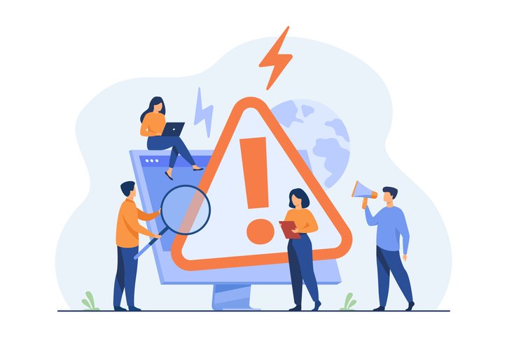
Common website mistakes on small business websites.
If you want visitors to spend time on your website and engage with its content, be sure to avoid making these common (but easily avoided) web design mistakes.
1. Not using responsive design
When a website has a responsive design, that means it can be viewed on virtually any screen and any device.
This is extremely important, considering more than half of all global internet activity is conducted on mobile devices. If your website visitors can’t browse your site on their smartphone or tablet, they’ll browse elsewhere.
2. Slow loading times
Online attention spans are short. When your site takes more than a few seconds to load, users are more likely to give up on trying to access your content.
Avoid this problem by choosing a website hosting provider that promises lightning-fast load times.
3. Too much content and clutter
A well-designed business website makes it easy for visitors to find the information they need, so avoid the urge to go overboard with images, text, and other elements.
There’s another reason not to clutter up your website — it will take much longer to load.
4. Not enough content
On the flip side, you also want to make sure that your business’s website has enough information for users.
People come to your website to learn about your business or organization, so give them what they’re looking for. Include relevant information about the company, its products or services, and anything else your audience might want to know.
5. Building without a plan
Striking the right balance between too much content and not enough is tricky, but it’s much easier when you have a plan.
Before you hire a web developer or attempt to create a business website on your own, think about your goals for the website:
- Is your website meant to be a lead-generating machine that brings in new business?
- Do you want to educate potential buyers?
- Are you looking to showcase your company’s portfolio of excellent work?
- Will you be selling products directly from your website?
Your answers to these questions, and others, will influence the design of your website.
6. Too many fonts
We’ve all seen (and tried to decipher) a website that’s filled with different fonts.
Using too many different font types and font styles creates a confusing experience for visitors. It’s impossible for them to understand what message you’re trying to get across.
As a rule of thumb, choose two or three fonts that complement each other.
7. Not enough whitespace
When people read things online, they tend to scan the content. Strategically using whitespace in your website’s design makes it easier for visitors to quickly access the information they need.
That doesn’t mean you should design a bare-bones site, but it does mean you should:
- Write short paragraphs (around two to three sentences per paragraph is a good guideline)
- Use sub-headings
- Include bullet points and numbered where relevant
- Use bold and italicized text to call out important information
When you implement these web design best practices, it’s easier for visitors to scan your website, which means they’re more likely to stay on your site and engage with its content.
8. A poor navigation experience
If visitors can’t move around your website with ease, they’re going to find sites that do offer a pleasant navigation experience.
Make sure your website’s navigation menu is easy to find and straightforward to use.
9. No clear call-to-action
This is another all-too-common website design mistake, and it can cost you business.
Your website is a marketing tool that’s designed to bring in new business, and calls-to-action guide visitors as they engage with your site.
Your call-to-action could be asking visitors to fill out a form, request a free quote, schedule a call, or any other action that makes sense for your company’s goals.
10. Neglecting testing and quality assurance
Before a website goes live, it should undergo rigorous quality assurance testing.
This part of the website design process ensures that the site looks great on all browsers and screen types. It also allows you to discover any usability issues before visitors find them for you.
At Codepoet, we have a team of Quality Assurance Analysts who make sure that every site we design and develop is ready for the real world. If you’re in the market for a new business website, consider getting in touch with us to learn more about our QA process.